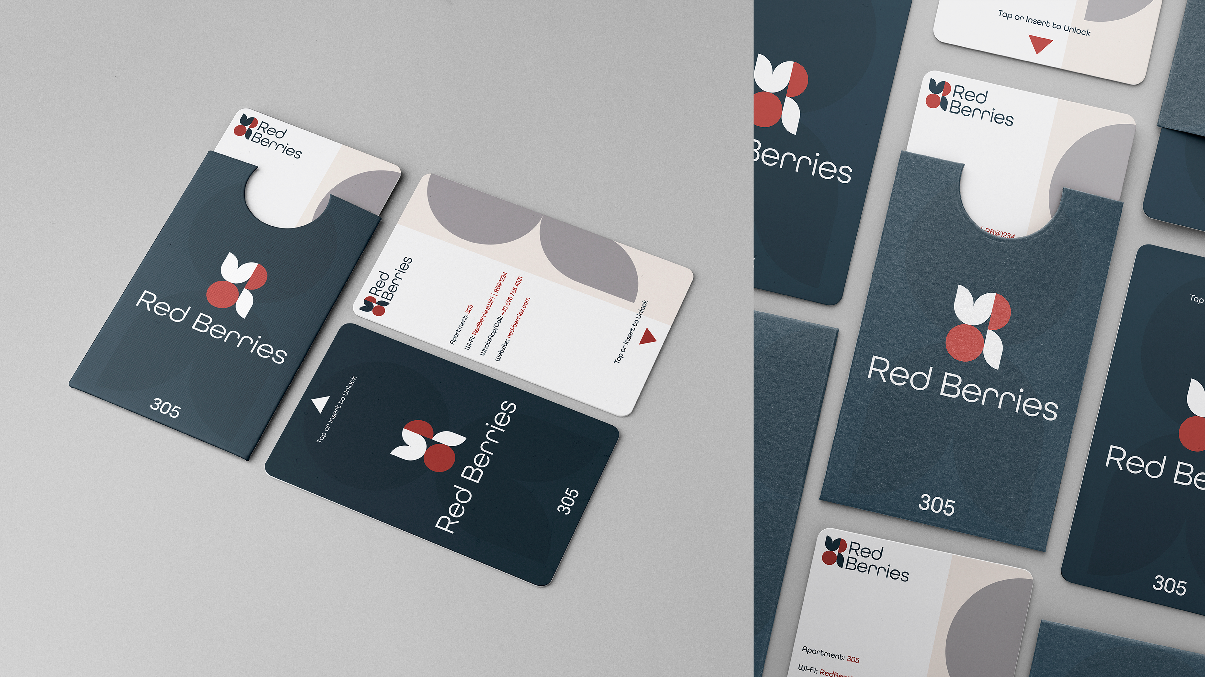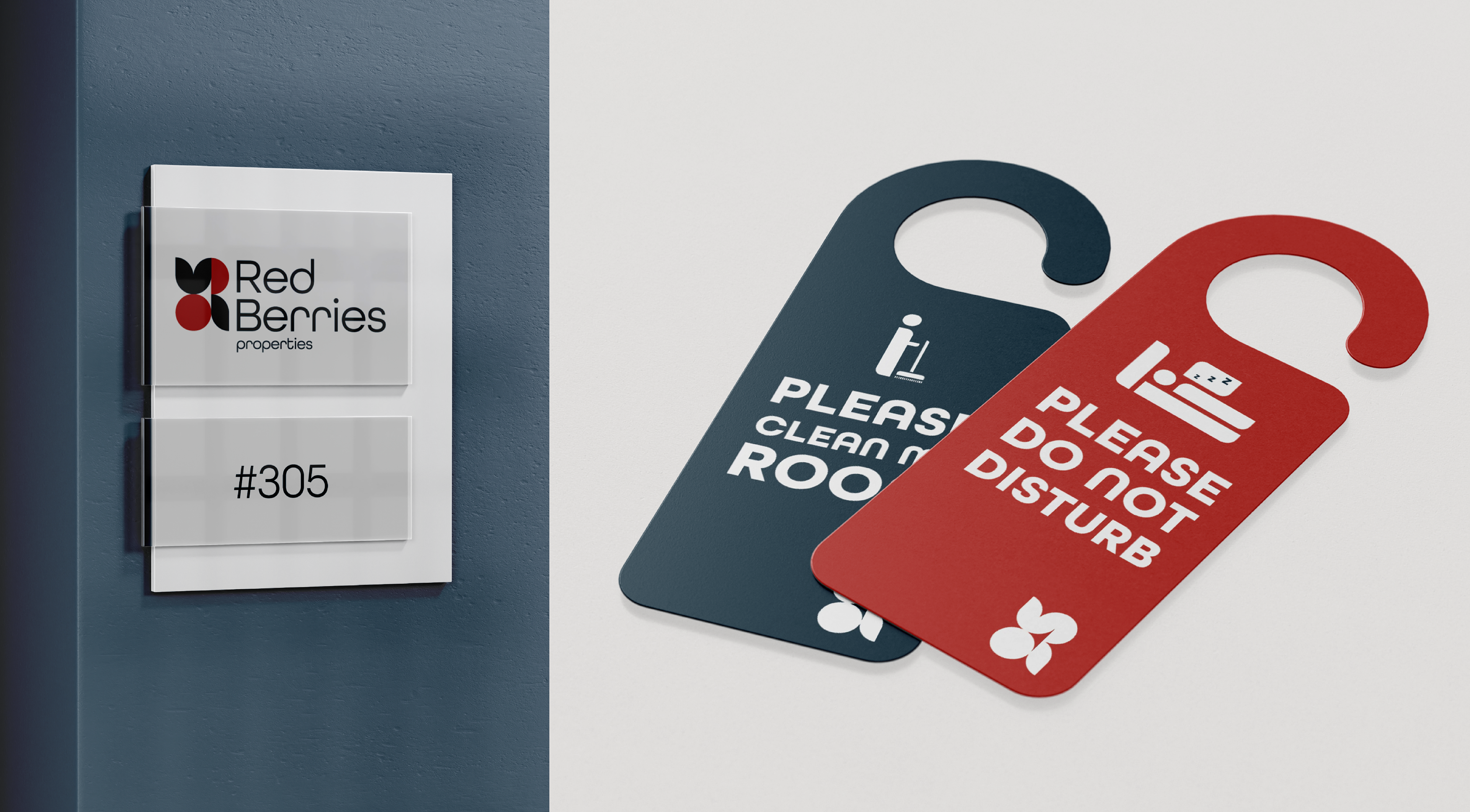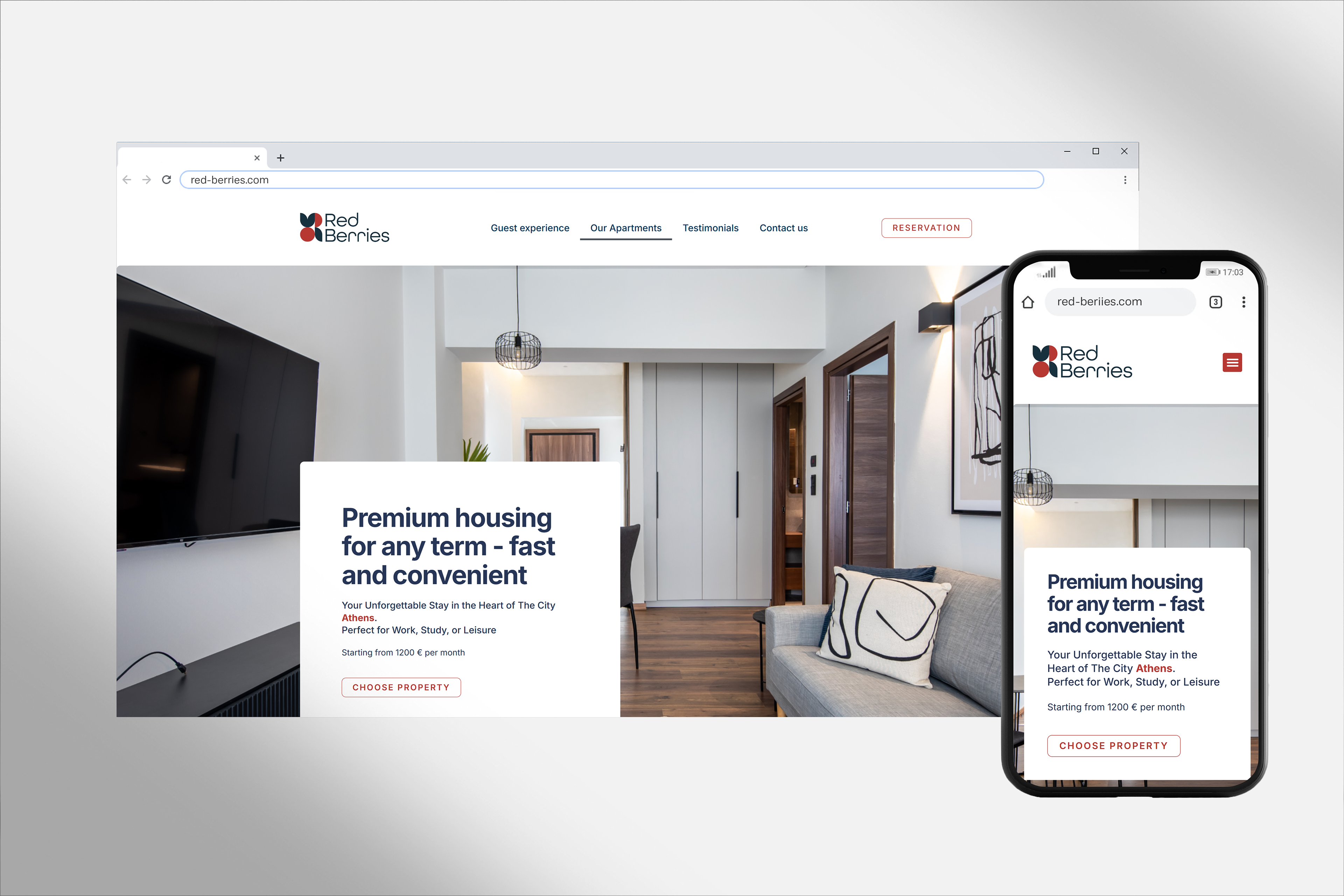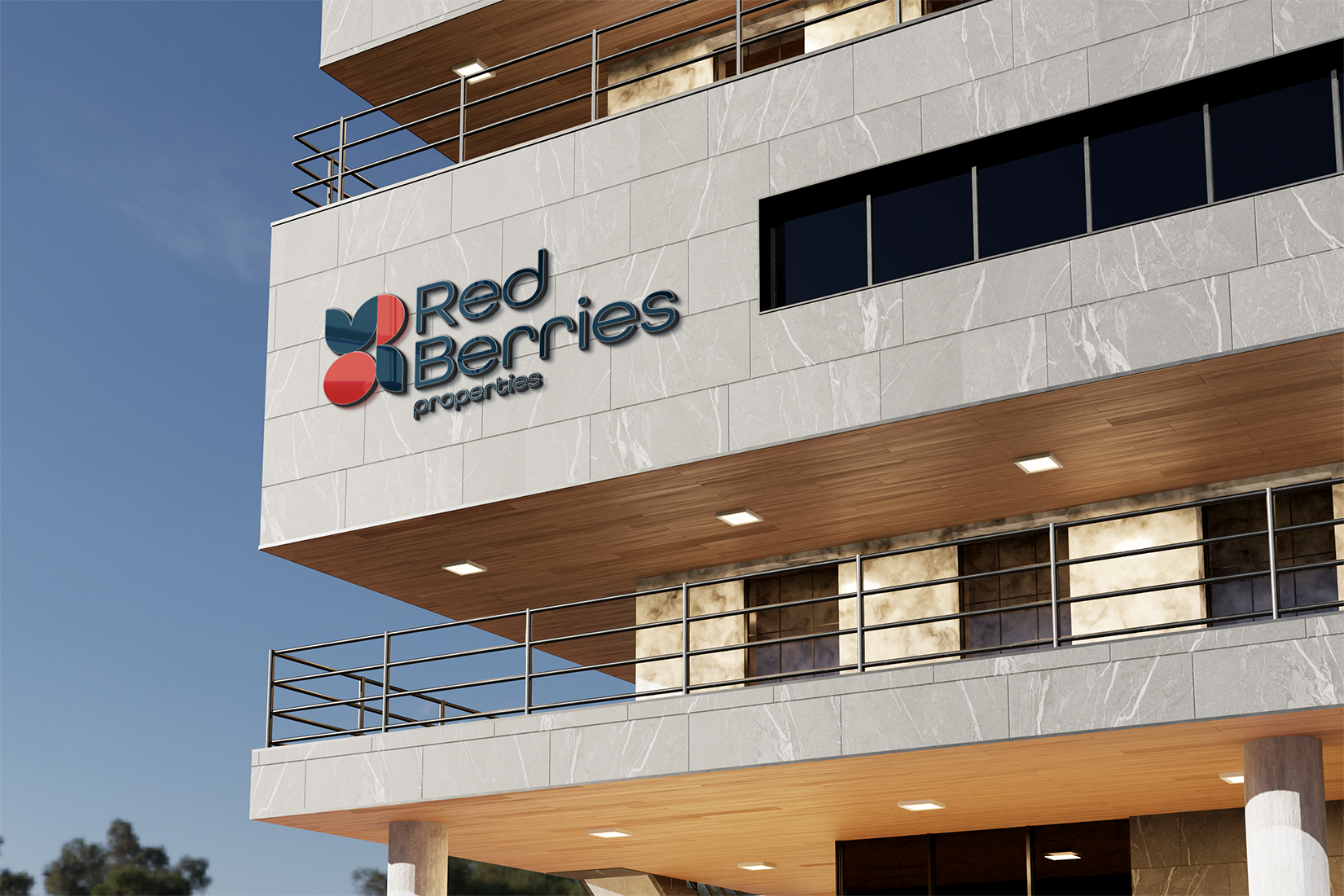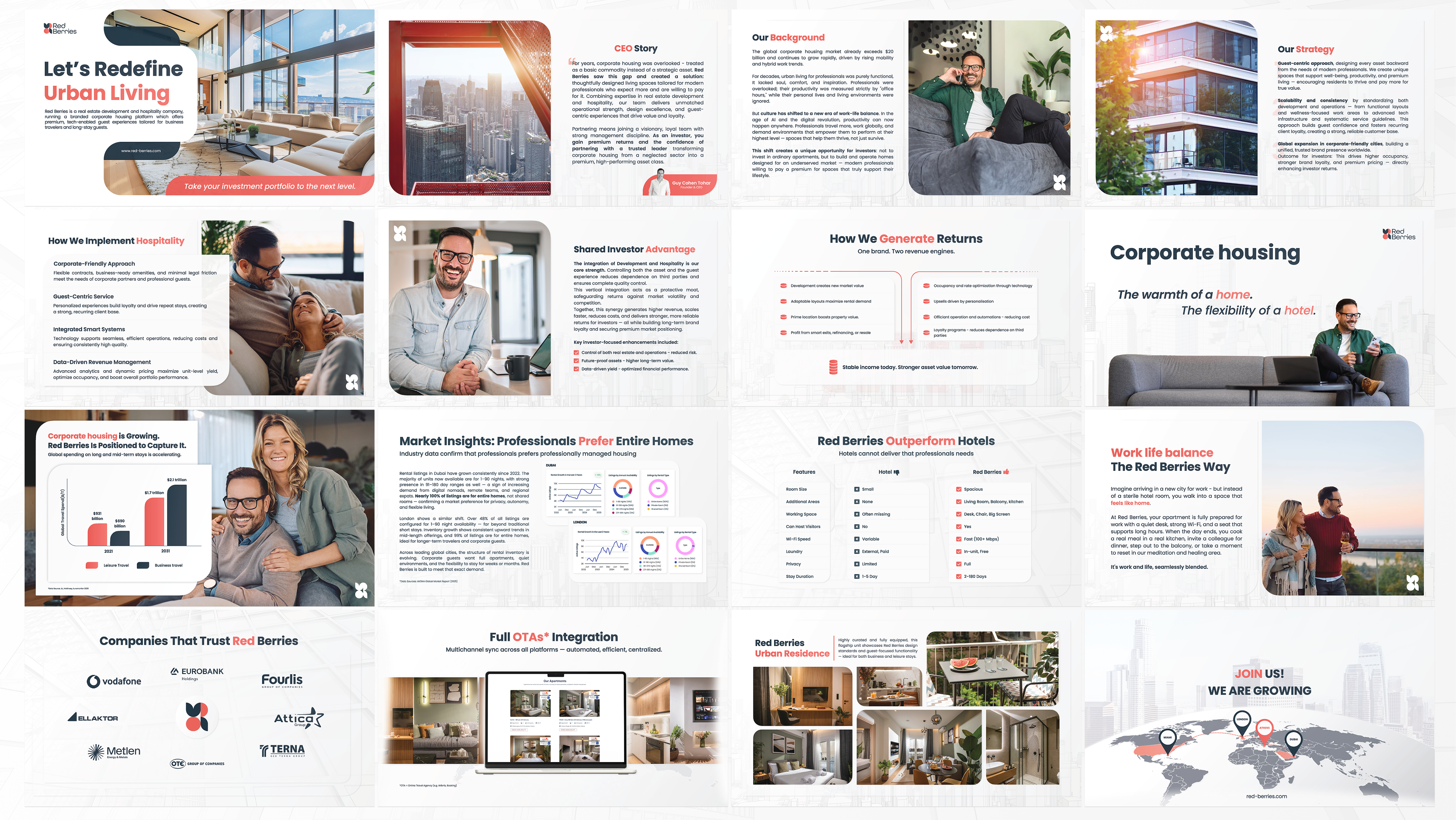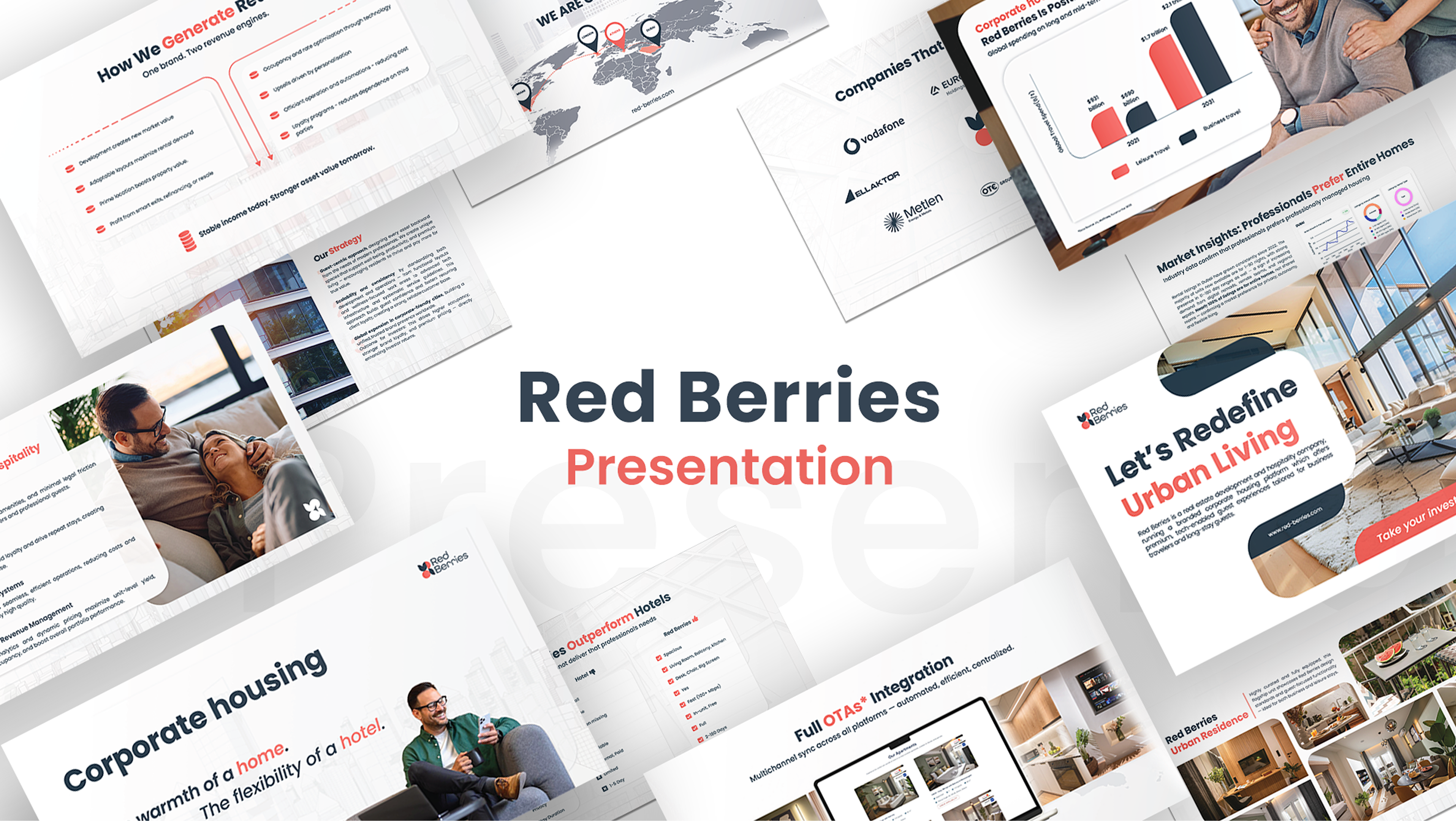


RED BERRIES PROPERTIES
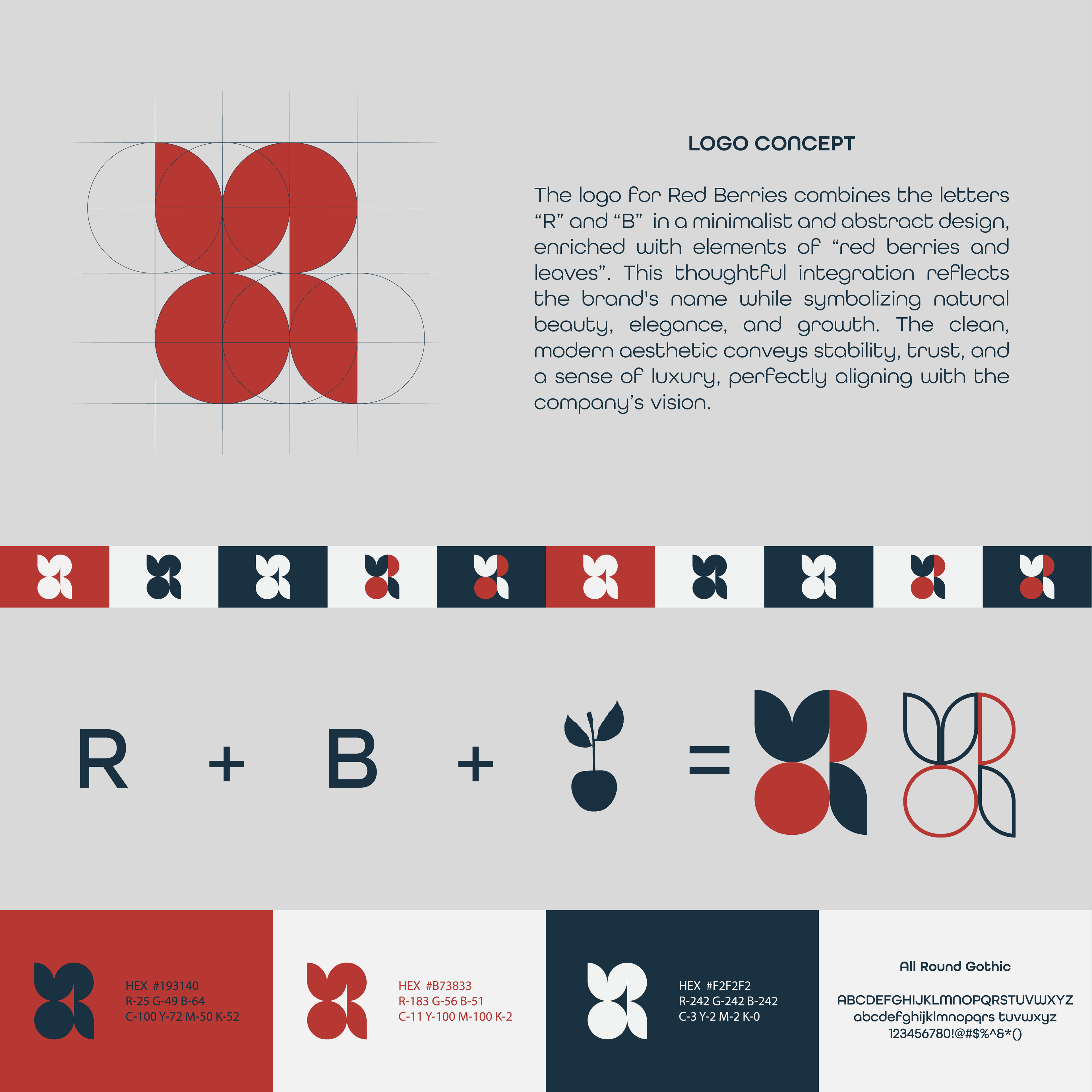
When working on the branding for Red Berries Properties, a real estate rental company specializing in properties in Greece, the client had a clear request: create a modern, youthful, and engaging logo that breaks away from the typical, overused real estate symbols like rooftops, keys, or houses. Instead, they wanted a fresh, dynamic identity that feels inviting while subtly integrating the initials R and B.
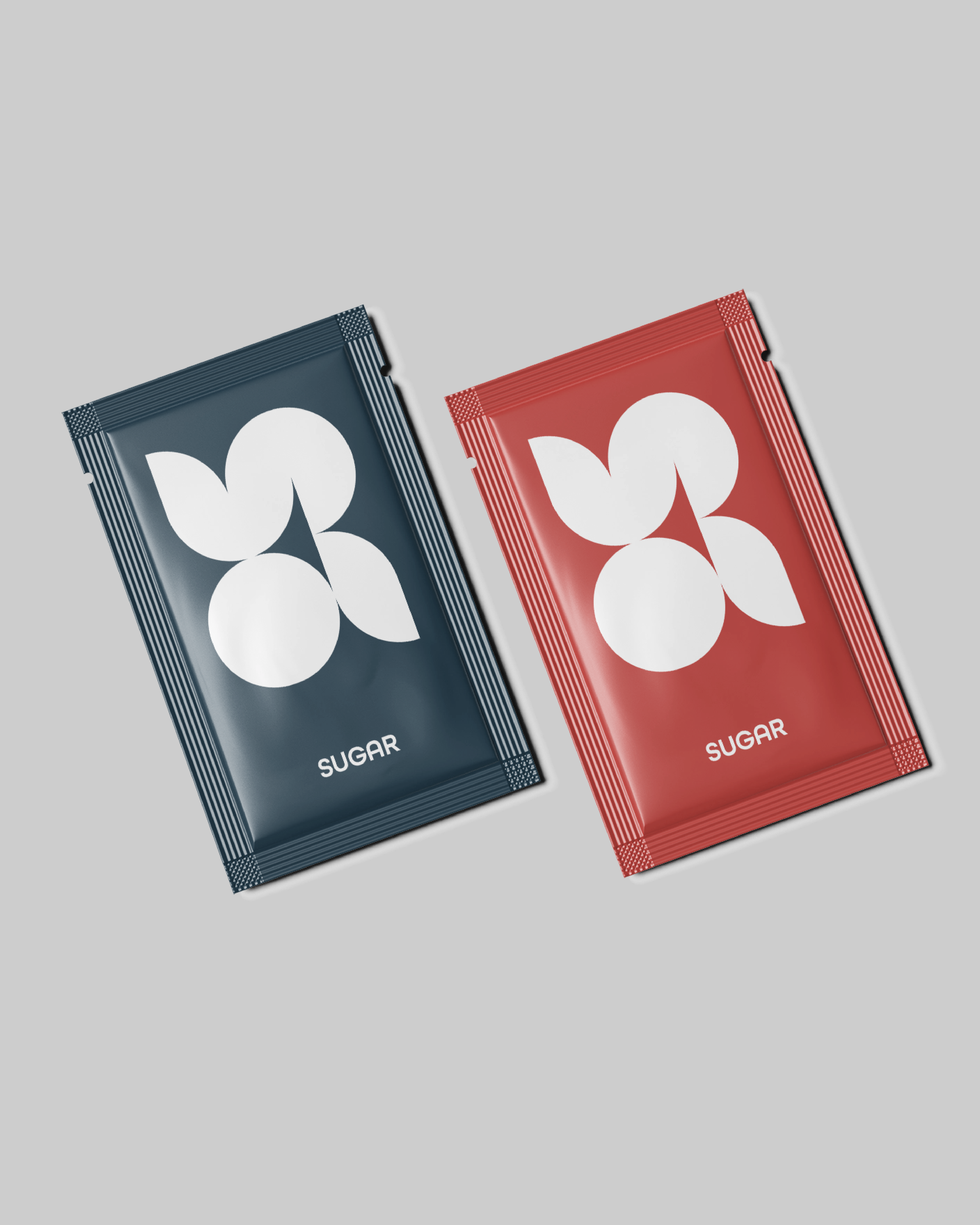
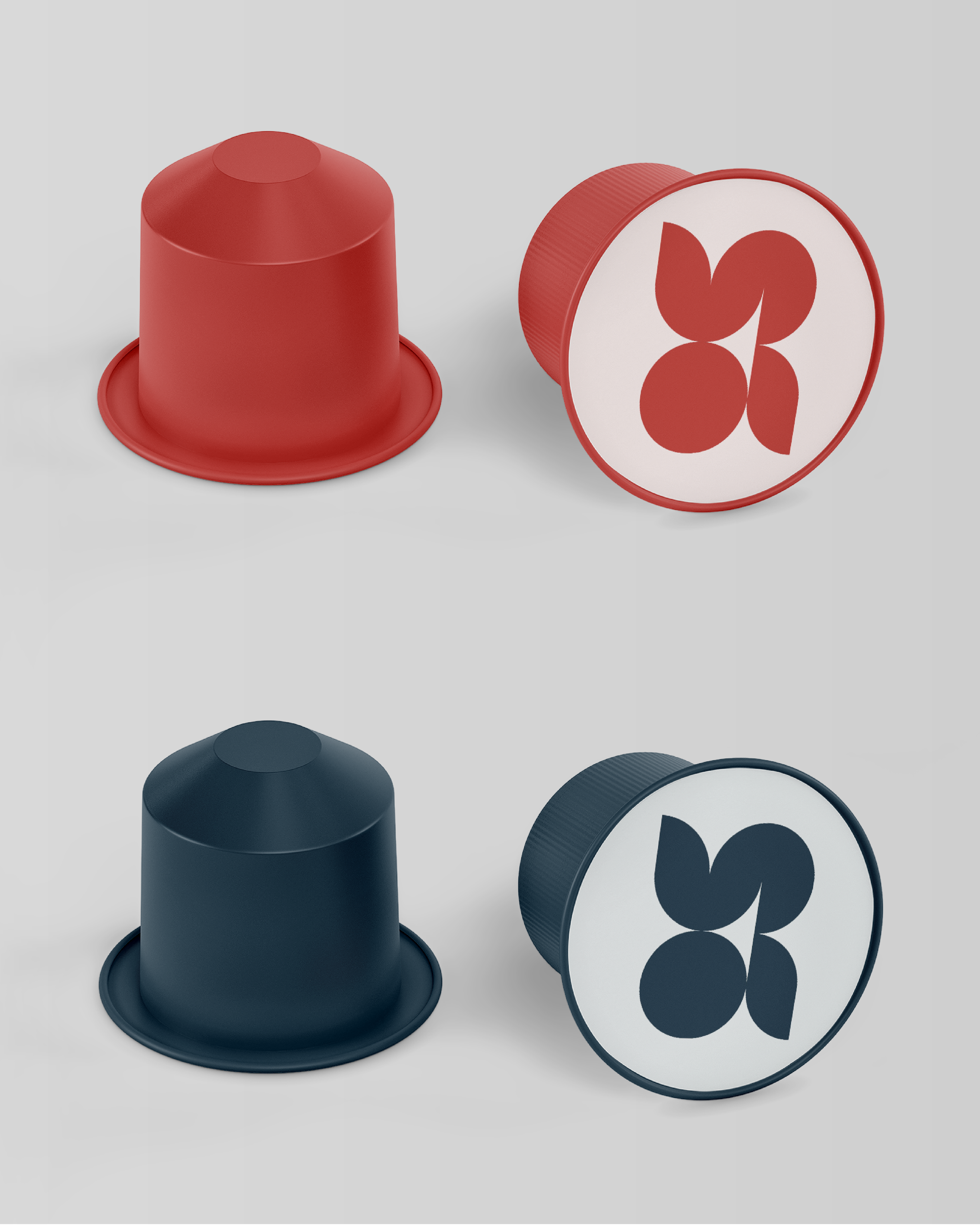
The concept behind the logo was to use simple geometric shapes to form two red berries—one whole and one partially cut—symbolizing availability, continuity, and a seamless rental experience. The design reflects the brand’s flexibility and readiness, ensuring that there’s always a perfect property waiting for the next guest.
To enhance the youthful and contemporary feel, I selected a deep navy blue for a professional yet modern touch, balanced with vibrant red to inject energy and personality into the brand. The result is a sleek, eye-catching identity that stands out in the real estate market, appealing to a new generation of travelers, digital nomads, and professionals looking for a stylish and hassle-free rental experience.